 windstarry's blog
CSS基础学习
CSS 基础选择器
标签选择器
html
// 所有相同标签选择出来
标签名 {
	属性1: 属性值1;
	属性2: 属性值2;
	属性3: 属性值3;
	...
}
// 所有相同标签选择出来
标签名 {
属性1: 属性值1;
属性2: 属性值2;
属性3: 属性值3;
...
}类选择器
html
// 可以选出1个或者多个标签
.类名 {
	属性1: 属性值1;
	属性2: 属性值2;
	...
}
// 可以选出1个或者多个标签
.类名 {
属性1: 属性值1;
属性2: 属性值2;
...
}多类名
html
    <style>
        .red {
            color: red;
        }
        .font35{
            font-size: 30px;
        }
    </style>

<div class="red font35">亚瑟</div>
1、在标签classa属性中写多个类名
2、多个类名中间必须用空格分开 <style>
.red {
color: red;
}
.font35{
font-size: 30px;
}
</style>
<div class="red font35">亚瑟</div>
1、在标签classa属性中写多个类名
2、多个类名中间必须用空格分开id选择器
html
// 只能选择一个标签且只能调用一次
#id名 {
	属性1: 属性值1;
	...
}
// 只能选择一个标签且只能调用一次
#id名 {
属性1: 属性值1;
...
}通配符选择器
html
// 所有标签修改样式  不需要调用
* {
	属性1: 属性值1;
	...
}
// 所有标签修改样式 不需要调用
* {
属性1: 属性值1;
...
}CSS 字体属性
html
body {
	font-family: '微软雅黑';
}
body {
font-family: '微软雅黑';
}字体大小
html
body {
	font-size: 20px;
}
body {
font-size: 20px;
}字体粗细
html
// 开发中,我们跟提倡使用数字 表示加粗或者变细   700 加粗 400 不加粗
.bold{
	font-weight: 700;
}
// 开发中,我们跟提倡使用数字 表示加粗或者变细 700 加粗 400 不加粗
.bold{
font-weight: 700;
}文字样式
html
// italic 倾斜    normal 正常
p {
	font-style: normal;
}
// italic 倾斜 normal 正常
p {
font-style: normal;
}字体复合属性
html
// 有严格顺序要求   至少有size 和 family 的值
body {
	// font: font-style font-weight font-size/line-height font-family;
	font: italic 700 16px 'Microsoft yahei';
}
// 有严格顺序要求 至少有size 和 family 的值
body {
// font: font-style font-weight font-size/line-height font-family;
font: italic 700 16px 'Microsoft yahei';
}| 属性 | 表示 | 注意点 |
|---|---|---|
| font-size | 字号 | 我们通常用的单位是px像素,一定要更上单位 |
| font-family | 字体 | 实际工作中按照团队约定来写字体 |
| font-weight | 字体粗细 | 加粗 700 or bold 不加粗 normal or 400 |
| font-style | 字体样式 | 倾斜是 italic 不倾斜是 normal |
| font | 字体连写 | 1.字体连写是有顺序对的 不能随便换位置 2.其中字号字体必现 |
CSS 文本属性
文本颜色
html
div {
	color: red;
	color: #ff0000;
	color: rgb(200, 0, 0);
}
div {
color: red;
color: #ff0000;
color: rgb(200, 0, 0);
}对齐文本
html
div {     // left 左对齐; right 右对齐; center 剧中对齐;
	text-align: center;
}
div { // left 左对齐; right 右对齐; center 剧中对齐;
text-align: center;
}装饰文本
html
div {   none 默认; underline 下划线; line-throught 删除线
	text-decoration: none;
}
div { none 默认; underline 下划线; line-throught 删除线
text-decoration: none;
}文本缩进
html
div {   // 段落首行缩进  2个缩进
	text-indent: 2em
}
div { // 段落首行缩进 2个缩进
text-indent: 2em
}行间距
html
p {
	lint-height: 26px
}
p {
lint-height: 26px
}| 属性 | 表示 | 注意点 |
|---|---|---|
| color | 文本颜色 | 十六进制 #fff |
| text-align | 文本对齐 | 设定文本水平对齐方式 |
| text-indent | 文本缩进 | 通常使用2个缩进 text-indent: 2em |
| text-decoration | 文本修饰 | 下划线 underline 取消下划线 none |
| line-height | 行高 | 控制行与行之间的距离 |
CSS 引用方式
内部样式表
html
// 内部样式表写在html页面内部,将所有css 代码抽取出来,单独放在<style> 标签中
<style>
    div {
        color: red;
        font-size: 12px;
    }
</style>
// 内部样式表写在html页面内部,将所有css 代码抽取出来,单独放在<style> 标签中
<style>
div {
color: red;
font-size: 12px;
}
</style>行类样式表
html
// 行类样式表 写在body里面
<div style="color: red; font-size: 12px;">这是行类样式表</div>
// 行类样式表 写在body里面
<div style="color: red; font-size: 12px;">这是行类样式表</div>外部样式表
html
// 样式单独写在CSS文件中,之后把CSS文件引用到HTML页面中使用
第一步:
创建一个后缀名为.css 的样式文件,把所有CSS代码都放入此文件中
第二部:
写入CSS样式
div {
	color: pink;
}
第三步:
引用CSS样式
<head>
	<link rel="stylesheet" href="css文件路径">
</head>
// 样式单独写在CSS文件中,之后把CSS文件引用到HTML页面中使用
第一步:
创建一个后缀名为.css 的样式文件,把所有CSS代码都放入此文件中
第二部:
写入CSS样式
div {
color: pink;
}
第三步:
引用CSS样式
<head>
<link rel="stylesheet" href="css文件路径">
</head>| 样式表 | 优点 | 缺点 | 使用情况 | 控制范围 |
|---|---|---|---|---|
| 行类样式表 | 书写方便 | 结构样式混写 | 较少 | 控制一个标签 |
| 内部样式表 | 部分结构和样式相分离 | 没有彻底分离 | 较多 | 控制一个页面 |
| 外部样式表 | 完全实现结构和样式分离 | 需要引入 | 推荐 | 控制多个页面 |
Emmet 语法
html
1.生成标签直接输入标签名按tab键即可,比如 div 然后tab键,就可以生成<div></div>
2.如果想要生成多个相同标签,加上*就可以了,比如 div*3 就可以快速生成3个div
3.如果有父子关系的标签,可以用 > 比如 ui>li 就可以了
4.如果有兄弟关系的标签,用 + 就可以了,比如 div+p
5.如果生成带有里类名或者id名字的,直接写 .demo 或者 #two tab键就可以了
6.如果生成的div类名是有顺序的,可以用自增符号 $   例如 .demo$*5
7.如果想要再生成标签内部写内容可以用 {} 表示  例如 div{我是一个div}
1.生成标签直接输入标签名按tab键即可,比如 div 然后tab键,就可以生成<div></div>
2.如果想要生成多个相同标签,加上*就可以了,比如 div*3 就可以快速生成3个div
3.如果有父子关系的标签,可以用 > 比如 ui>li 就可以了
4.如果有兄弟关系的标签,用 + 就可以了,比如 div+p
5.如果生成带有里类名或者id名字的,直接写 .demo 或者 #two tab键就可以了
6.如果生成的div类名是有顺序的,可以用自增符号 $ 例如 .demo$*5
7.如果想要再生成标签内部写内容可以用 {} 表示 例如 div{我是一个div}CSS 复合选择器
后代选择器
html
// 元素1 和 元素2 中间用空格隔开
// 元素1是父级,元素2是子级,最终选择的是元素2
元素1 元素2 { 样式声明 }
例如:
ul li {样式声明}   // 选择 ul 里面所有 li 标签的元素
// 元素1 和 元素2 中间用空格隔开
// 元素1是父级,元素2是子级,最终选择的是元素2
元素1 元素2 { 样式声明 }
例如:
ul li {样式声明} // 选择 ul 里面所有 li 标签的元素去掉li前面的项目符号(小圆点)
html
list-style: none;list-style: none;子选择器
html
// 元素1 和 元素2 中间用大于号隔开
// 元素1 是父亲 元素2 是孩子,最终选择的是元素2
元素1 > 元素2 { 样式声明 }
例如:
div > p {样式声明}    // 选择 div里面所有最近的一级 p 标签元素
// 元素1 和 元素2 中间用大于号隔开
// 元素1 是父亲 元素2 是孩子,最终选择的是元素2
元素1 > 元素2 { 样式声明 }
例如:
div > p {样式声明} // 选择 div里面所有最近的一级 p 标签元素并集选择器
html
// 元素1 和 元素2 中间用逗号隔开
// 逗号可以理解为和的意思
// 并集选择器通常用于集体声明
元素1,元素2 { 样式声明 }
例如:
ul,div { 样式声明 }   // 选择 ul 和 div 标签元素
// 元素1 和 元素2 中间用逗号隔开
// 逗号可以理解为和的意思
// 并集选择器通常用于集体声明
元素1,元素2 { 样式声明 }
例如:
ul,div { 样式声明 } // 选择 ul 和 div 标签元素伪类选择器
html
// 注意事项
严格按照 lvha 的顺序声明:link - visited - hover - active
a:link    // 选择所有未被访问的链接
a:visited  // 选择所有已被访问的链接
a:hover   // 选择鼠标指针位于其上的链接
a:active   // 选择活动链接

例如:
/* a:hover 选择鼠标经过的那个链接 */
a:hover {
      color: skyblue;
}
// 注意事项
严格按照 lvha 的顺序声明:link - visited - hover - active
a:link // 选择所有未被访问的链接
a:visited // 选择所有已被访问的链接
a:hover // 选择鼠标指针位于其上的链接
a:active // 选择活动链接
例如:
/* a:hover 选择鼠标经过的那个链接 */
a:hover {
color: skyblue;
}:focus 伪类选择器
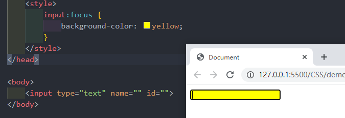
html
焦点就是光标,一般情况下<input>类表单元素能获取,因此这个选择器也主要针对与表单元素来说
input:focus {
	background-color:yellow;
}焦点就是光标,一般情况下<input>类表单元素能获取,因此这个选择器也主要针对与表单元素来说
input:focus {
background-color:yellow;
}
| 选择器 | 作用 | 特征 | 使用情况 | 隔开符号及用法 |
|---|---|---|---|---|
| 后代选择器 | 用来选择后代元素 | 可以是子孙后代 | 较多 | 符号是空格 .nav a |
| 子代选择器 | 选择最近一级元素 | 只选亲儿子 | 较少 | 符号是大于 .nav >p |
| 并集选择器 | 选择某些相同样式的元素 | 可以用于集体声明 | 较多 | 符号是逗号 .nav, .header |
| 链接伪类选择器 | 选择不同状态的链接 | 跟链接相关 | 较多 | 重点记住a{} 和 a:hover 实际开发的写法 |
| :focus 选择器 | 选择活着的光标的表单 | 跟表单相关 | 较少 | input:focus 记住这个写法 |
CSS 的元素显示模式
块元素
html
常见的块元素有<h1>~<h6>、<p>、<div>、<ul>、<ol>、<li>等,其中<div>标签是最典型的块元素
<p>标签主要用于存放文字,因此<p>里面不能放块级元素,特别不能放<div>
<h1>~<h6>也不能放块元素
快级元素的特点:
    - 比较霸道,自己独占一行
    - 高度、宽度、外边距以及内边距都可以控制
    - 宽度默认是容器(父级宽度)的100%
    - 是一个容器及盒子,里面可以放行内或者块级元素

举例:
<div>比较霸道,自己独占一行</div>瑟瑟发抖常见的块元素有<h1>~<h6>、<p>、<div>、<ul>、<ol>、<li>等,其中<div>标签是最典型的块元素
<p>标签主要用于存放文字,因此<p>里面不能放块级元素,特别不能放<div>
<h1>~<h6>也不能放块元素
快级元素的特点:
- 比较霸道,自己独占一行
- 高度、宽度、外边距以及内边距都可以控制
- 宽度默认是容器(父级宽度)的100%
- 是一个容器及盒子,里面可以放行内或者块级元素
举例:
<div>比较霸道,自己独占一行</div>瑟瑟发抖行内元素
html
常见的行内元素有<a>、<strong>、<b>、<em>、<i>、<del>、<s>、<ins>、<u>、<span>等,其中<span>标签是最典型的行内元素。
链接里面不能再放链接
特殊情况链接<a>里面可以放块级元素
行类元素的特点:
    - 相邻对的内元素一行上,一行可以显示多个
    - 高、宽直接设置时无效的
    - 默认宽度就是它本身内容的宽度
    - 行内元素只能容纳文本或其他行内元素
举例:
<span>pink me</span> <strong>长路漫漫</strong>常见的行内元素有<a>、<strong>、<b>、<em>、<i>、<del>、<s>、<ins>、<u>、<span>等,其中<span>标签是最典型的行内元素。
链接里面不能再放链接
特殊情况链接<a>里面可以放块级元素
行类元素的特点:
- 相邻对的内元素一行上,一行可以显示多个
- 高、宽直接设置时无效的
- 默认宽度就是它本身内容的宽度
- 行内元素只能容纳文本或其他行内元素
举例:
<span>pink me</span> <strong>长路漫漫</strong>行内块元素
html
常见的行内块元素有<img />、<input />、<td>,它们同时具有块元素和内元素的特点。称为行内块元素
行内块元素的特点:
    - 和相邻行内元素(行内块)在一行上,但是他们之间会有空白缝隙。一行可以显示多个
    - 默认宽度就是它本身内容的宽度(行内元素特点)
- 高度,行高、外边距以及内边距都可以控制常见的行内块元素有<img />、<input />、<td>,它们同时具有块元素和内元素的特点。称为行内块元素
行内块元素的特点:
- 和相邻行内元素(行内块)在一行上,但是他们之间会有空白缝隙。一行可以显示多个
- 默认宽度就是它本身内容的宽度(行内元素特点)
- 高度,行高、外边距以及内边距都可以控制
| 元素模式 | 元素排列 | 设置样式 | 默认宽度 | 包含 |
|---|---|---|---|---|
| 块级元素 | 一行只能放一个块级元素 | 可以设置宽度高度 | 容器的100% | 容器级可以包含任何标签 |
| 行内元素 | 一行可以放多个行内元素 | 不可以直接设置宽度高度 | 它本身内容的宽度 | 容纳文本或其他行内元素 |
| 行内块元素 | 一行放多个行内元素 | 可以设置宽度和高度 | 它本身内容的宽度 |
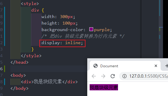
元素显示模式转换
html
行内元素转换成块级元素
转换为块元素:display:block;
转换为行内元素:display:inline;
行内元素转换成块级元素
转换为块元素:display:block;
转换为行内元素:display:inline;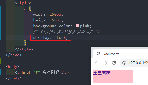
一个案例:
html
    <style>
        a {
            display: block;
            width: 230px;
            height: 40px;
            background-color: #55585a;
            font-size: 14px;
            color: #fff;
            text-decoration: none;
            text-indent: 2em;
        }
        a:hover{
            background-color: #ff6f00;
        }
    </style>


<body>
    <a href="#">手机 电话卡</a>
    <a href="#">电视 盒子</a>
    <a href="#">笔记本 平板</a>
    <a href="#">出行 穿戴</a>
    <a href="#">智能 路由器</a>
    <a href="#">健康 儿童</a>
    <a href="#">耳机 音响</a>
</body> <style>
a {
display: block;
width: 230px;
height: 40px;
background-color: #55585a;
font-size: 14px;
color: #fff;
text-decoration: none;
text-indent: 2em;
}
a:hover{
background-color: #ff6f00;
}
</style>
<body>
<a href="#">手机 电话卡</a>
<a href="#">电视 盒子</a>
<a href="#">笔记本 平板</a>
<a href="#">出行 穿戴</a>
<a href="#">智能 路由器</a>
<a href="#">健康 儿童</a>
<a href="#">耳机 音响</a>
</body>单行文字垂直居中
html
line-height = height 高度
padding-top: 20px;  或者  line-height: (height 值)px;
line-height = height 高度
padding-top: 20px; 或者 line-height: (height 值)px;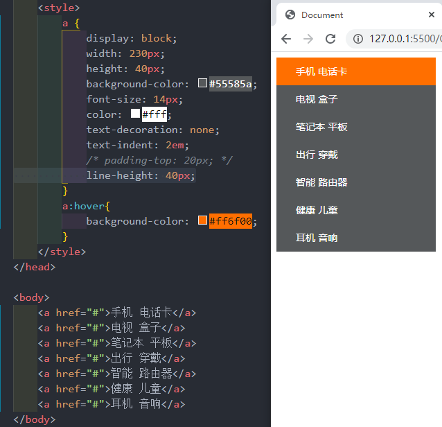
CSS 背景
背景颜色
html
background-color:颜色值;background-color:颜色值;CSS 背景图片
html
background-image: url(url)background-image: url(url)CSS 背景平铺
html
background-repeat: repeat | no-repeat | repeat-x | repeat-y
- repeat:背景图像在纵向和横向上平铺
- no-repeat:背景图像不平铺
- repeat-x:背景图像在横向平铺
- repeat-y:背景图像在纵向平铺
background-repeat: repeat | no-repeat | repeat-x | repeat-y
- repeat:背景图像在纵向和横向上平铺
- no-repeat:背景图像不平铺
- repeat-x:背景图像在横向平铺
- repeat-y:背景图像在纵向平铺背景图片位置
html
background-position:x  y;
参数代表的意思是:x坐标和y坐标。可以使用方向名词或者精确单位或混合单位
background-position:x y;
参数代表的意思是:x坐标和y坐标。可以使用方向名词或者精确单位或混合单位| 参数值 | 说明 |
|---|---|
| length | 百分比 | 由浮点数和单位标识符组成长度值 |
| position | top | center | bottom | left | right |
背景图像固定(视差滚动)
html
background-attachment:scroll | fixedbackground-attachment:scroll | fixed| 参数 | 作用 |
|---|---|
| scroll | 背景图像是随着对象内容滚动 |
| fixed | 背景图像固定 |
背景复合写法
html
background:背景颜色 背景图片地址 背景平铺 背景图像滚动 背景图片位置
例子:
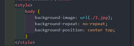
background: #ffff url(./1.jpg) no-repeat fixed center top;background:背景颜色 背景图片地址 背景平铺 背景图像滚动 背景图片位置
例子:
background: #ffff url(./1.jpg) no-repeat fixed center top;背景色半透明
html
background: rgba(0, 0, 0, 0, 0.3);
最后一个参数是alpha透明度,取值范围0~1之间
background: rgba(0, 0, 0, 0, 0.3);
最后一个参数是alpha透明度,取值范围0~1之间| 属性 | 作用 | 值 |
|---|---|---|
| background-color | 背景颜色 | 预定义的颜色值/十六进制/RGB代码 |
| background-image | 背景图片 | url(图片路径) |
| background-repeat | 是否平铺 | repeat/no-repeat/repeat-x/repeat-y |
| background-position | 背景位置 | length/position 分别是x 和 y坐标 |
| background-attachment | 背景附着 | srcoll(背景滚动) / fixed(背景固定) |
| 背景复合写法 | 书写更简单 | 背景颜色 背景图片地址 背景平铺 背景图像滚动 背景图片位置 |
| 背景色半透明 | 背景颜色半透明 | background: rgba(0, 0, 0, 0.3); 后面必须是四个值 |
CSS 三大特性
层叠行
html
相同选择器给设置相同的样式,此时一个样式就会覆盖(层叠)另一个冲突的样式。层叠性主要解决样式冲突的问题
层叠性原则:
- 样式冲突。遵顼的原则就是就近原则,哪个样式离结构近,就执行哪个样式
- 样式不冲突,不会层叠
相同选择器给设置相同的样式,此时一个样式就会覆盖(层叠)另一个冲突的样式。层叠性主要解决样式冲突的问题
层叠性原则:
- 样式冲突。遵顼的原则就是就近原则,哪个样式离结构近,就执行哪个样式
- 样式不冲突,不会层叠继承性
html
CSS中的继承:子标签会继承父标签的某些样式,如文本颜色和字号
子元素可以继承父元素的样式(text- ,font- ,line- 这些元素开头的可以继承,以及color属性)

行高的继承性
body {    // 1.5 指的是 当前字体的1.5倍大
	font:12px/1.5 Microsoft YaHei;
}
CSS中的继承:子标签会继承父标签的某些样式,如文本颜色和字号
子元素可以继承父元素的样式(text- ,font- ,line- 这些元素开头的可以继承,以及color属性)
行高的继承性
body { // 1.5 指的是 当前字体的1.5倍大
font:12px/1.5 Microsoft YaHei;
}优先级
html
当同一个元素指定多个选择器,就会有优先级的产生
- 选择器相同,则执行层叠性
- 选择器不同,则根据选择器权重执行
当同一个元素指定多个选择器,就会有优先级的产生
- 选择器相同,则执行层叠性
- 选择器不同,则根据选择器权重执行盒子模型
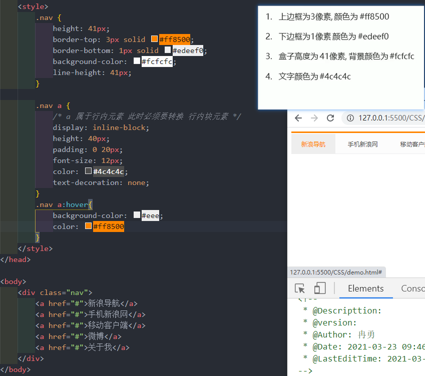
边框(border)
html
border 可以设置元素的边框。边框有三部分组成:边框宽度(粗细)边框样式 边框颜色
语法:
border: border-width || border-style || border-color
边框复合写法:
border: 1px solid red;  // 此复合写法没有顺序
边框分开写法:
border-top: 1px solid red;  // 只设定上边框,其余同框   top bottom left right
border 可以设置元素的边框。边框有三部分组成:边框宽度(粗细)边框样式 边框颜色
语法:
border: border-width || border-style || border-color
边框复合写法:
border: 1px solid red; // 此复合写法没有顺序
边框分开写法:
border-top: 1px solid red; // 只设定上边框,其余同框 top bottom left right| 属性 | 作用 |
|---|---|
| border-width | 定义边框粗细,单位是px |
| border-style | 边框样式 |
| border-color | 边框颜色 |
表格的细线边框
html
border-collapse 属性控制浏览器绘制表格边框的方式。它控制相邻单元格的边框
语法:
border-collapse: collapse;
- collapse 合并的意思
- border-collapse:collapse;  表示相邻边框合并在一起
border-collapse 属性控制浏览器绘制表格边框的方式。它控制相邻单元格的边框
语法:
border-collapse: collapse;
- collapse 合并的意思
- border-collapse:collapse; 表示相邻边框合并在一起内边距(padding)
html
padding 属性用于设置内边距,即边框与内容之间的距离。
语法:
padding-left:5px;
内边距复合写法:
padding: 5px;   // 上下左右都有5个像素内边距;
padding: 5px 10px;  // 上下内边距是5像素 左右内边距是10像素;
padding: 5px 10px 20px;  // 上下内边距5像素 左右内边距10像素 下内边距20像素
padding: 5px 10px 20px 30px;  //  上是5像素 右10像素 下20像素 左30像素  顺时针
padding 属性用于设置内边距,即边框与内容之间的距离。
语法:
padding-left:5px;
内边距复合写法:
padding: 5px; // 上下左右都有5个像素内边距;
padding: 5px 10px; // 上下内边距是5像素 左右内边距是10像素;
padding: 5px 10px 20px; // 上下内边距5像素 左右内边距10像素 下内边距20像素
padding: 5px 10px 20px 30px; // 上是5像素 右10像素 下20像素 左30像素 顺时针| 属性 | 作用 |
|---|---|
| padding-left | 左内边距 |
| padding-right | 右内边距 |
| padding-top | 上W内边距 |
| padding-bottom | 下内边距 |
外边距(margin)
html
margin属性用于设置外边距,即控制盒子和盒子之间距离
外边距复合写法:
和内边距一样写法
margin属性用于设置外边距,即控制盒子和盒子之间距离
外边距复合写法:
和内边距一样写法| 属性 | 作用 |
|---|---|
| margin-left | 左外边距 |
| margin-right | 右外边距 |
| margin-top | 上外边距 |
| margin-bottom | 下外边距 |
外边距典型应用
html
外边距可以让块级盒子水平居中
- 盒子必须指定宽度(width)
- 盒子左右的外边距都设置为auto
语法:
margin:0 auto;

.header {
	width:960px;
	margin:0 auto;
}
以上方法是让快元素水平居中,行内元素或者行内快元素水平居中给其父元素添加 text-align:center 即可
外边距可以让块级盒子水平居中
- 盒子必须指定宽度(width)
- 盒子左右的外边距都设置为auto
语法:
margin:0 auto;
.header {
width:960px;
margin:0 auto;
}
以上方法是让快元素水平居中,行内元素或者行内快元素水平居中给其父元素添加 text-align:center 即可外边距合并
html
嵌套快元素垂直外边距的塌陷
overflow:hidden;
嵌套快元素垂直外边距的塌陷
overflow:hidden;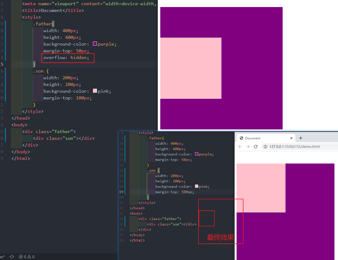
清除内外边距
html
网页元素很多都带有默认的内外边距,因此我们在布局前,首先要清除下网页元素的内外边距。
语法:
* {
	padding: 0;    // 清除内边距
	margin: 0;   // 清除外边距
}
网页元素很多都带有默认的内外边距,因此我们在布局前,首先要清除下网页元素的内外边距。
语法:
* {
padding: 0; // 清除内边距
margin: 0; // 清除外边距
}案例1:
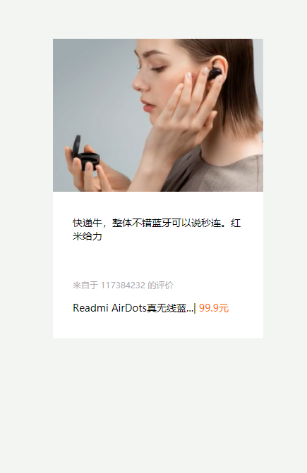
html
<!DOCTYPE html>
<html lang="en">

<head>
    <meta charset="UTF-8">
    <meta http-equiv="X-UA-Compatible" content="IE=edge">
    <meta name="viewport" content="width=device-width, initial-scale=1.0">
    <title>Document</title>
    <style>
        * {
            padding: 0;
            margin: 0;
        }
        a {
            color: #333;
            text-decoration: none;
        }
        body {
            background-color: #f3f5f2;
        }

        .box {
            width: 298px;
            height: 425px;
            background-color: #fff;
            /* 让块级的盒子水平居中对齐 */
            margin: 100px auto;
        }

        .box img {
            width: 100%;
        }

        .review {
            height: 70px;
            font-size: 14px;
            padding: 0 28px;
            margin-top: 30px;
        }

        .appraise {
            font-size: 12px;
            color: #b0afb1;
            margin-top: 20px;
            padding: 0 28px
        }

        .info {
            font-size: 14px;
            margin-top: 15px;
            padding: 0 28px;
        }

        .info h4 {
            display: inline-block;
            font-weight: 400;

        }

        .info span {
            color: #ff6700;
        }
        .info em {
            font-style: normal;
            color: #ebe4e0;
            margin: 0 6px 0 9px
        }
    </style>
</head>

<body>
    <div class="box">
        <a href="#"><img src="img/1.png" alt=""></a>
        <p class="review"><a href="#">快递牛,整体不错蓝牙可以说秒连。红米给力</a></p>
        <div class="appraise">来自于 117384232 的评价</div>
        <div class="info">
            <h4><a href="#">Readmi AirDots真无线蓝...</a></h4>
            <em>|</em>
            <span> 99.9元</span>
        </div>
    </div>
</body>

</html><!DOCTYPE html>
<html lang="en">
<head>
<meta charset="UTF-8">
<meta http-equiv="X-UA-Compatible" content="IE=edge">
<meta name="viewport" content="width=device-width, initial-scale=1.0">
<title>Document</title>
<style>
* {
padding: 0;
margin: 0;
}
a {
color: #333;
text-decoration: none;
}
body {
background-color: #f3f5f2;
}
.box {
width: 298px;
height: 425px;
background-color: #fff;
/* 让块级的盒子水平居中对齐 */
margin: 100px auto;
}
.box img {
width: 100%;
}
.review {
height: 70px;
font-size: 14px;
padding: 0 28px;
margin-top: 30px;
}
.appraise {
font-size: 12px;
color: #b0afb1;
margin-top: 20px;
padding: 0 28px
}
.info {
font-size: 14px;
margin-top: 15px;
padding: 0 28px;
}
.info h4 {
display: inline-block;
font-weight: 400;
}
.info span {
color: #ff6700;
}
.info em {
font-style: normal;
color: #ebe4e0;
margin: 0 6px 0 9px
}
</style>
</head>
<body>
<div class="box">
<a href="#"><img src="img/1.png" alt=""></a>
<p class="review"><a href="#">快递牛,整体不错蓝牙可以说秒连。红米给力</a></p>
<div class="appraise">来自于 117384232 的评价</div>
<div class="info">
<h4><a href="#">Readmi AirDots真无线蓝...</a></h4>
<em>|</em>
<span> 99.9元</span>
</div>
</div>
</body>
</html>案例2:
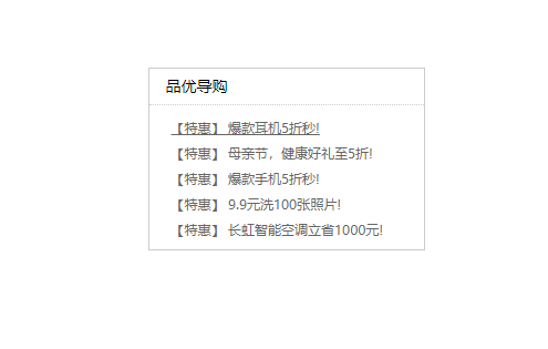
html
<!DOCTYPE html>
<html lang="en">

<head>
    <meta charset="UTF-8">
    <meta http-equiv="X-UA-Compatible" content="IE=edge">
    <meta name="viewport" content="width=device-width, initial-scale=1.0">
    <title>新闻快报模块</title>
    <style>
        * {
            margin: 0;
            padding: 0;
        }

        li {
            /* 去掉li前面的小圆点 */
            list-style: none;
        }

        .box {
            width: 248px;
            height: 163px;
            border: 1px solid #ccc;
            margin: 100px auto;
        }

        .box h3 {
            height: 32px;
            border-bottom: 1px dotted #ccc;
            font-size: 14px;
            font-weight: 400;
            line-height: 32px;
            padding-left: 15px;
        }

        .box ul li a {
            font-size: 12px;
            color: #666;
            text-decoration: none;
        }

        .box ul li a:hover {
            text-decoration: underline;
        }

        .box ul li {
            height: 23px;
            line-height: 23px;
            padding-left: 20px;
        }

        .box ul {
            margin-top: 7px;
        }
    </style>
</head>

<body>
    <div class="box">
        <h3>品优导购</h3>
        <ul>
            <li><a href="#"> 【特惠】 爆款耳机5折秒!</a></li>
            <li><a href="#"> 【特惠】 母亲节,健康好礼至5折!</a></li>
            <li><a href="#"> 【特惠】 爆款手机5折秒!</a></li>
            <li><a href="#"> 【特惠】 9.9元洗100张照片!</a></li>
            <li><a href="#"> 【特惠】 长虹智能空调立省1000元!</a></li>
        </ul>
    </div>


</body>

</html><!DOCTYPE html>
<html lang="en">
<head>
<meta charset="UTF-8">
<meta http-equiv="X-UA-Compatible" content="IE=edge">
<meta name="viewport" content="width=device-width, initial-scale=1.0">
<title>新闻快报模块</title>
<style>
* {
margin: 0;
padding: 0;
}
li {
/* 去掉li前面的小圆点 */
list-style: none;
}
.box {
width: 248px;
height: 163px;
border: 1px solid #ccc;
margin: 100px auto;
}
.box h3 {
height: 32px;
border-bottom: 1px dotted #ccc;
font-size: 14px;
font-weight: 400;
line-height: 32px;
padding-left: 15px;
}
.box ul li a {
font-size: 12px;
color: #666;
text-decoration: none;
}
.box ul li a:hover {
text-decoration: underline;
}
.box ul li {
height: 23px;
line-height: 23px;
padding-left: 20px;
}
.box ul {
margin-top: 7px;
}
</style>
</head>
<body>
<div class="box">
<h3>品优导购</h3>
<ul>
<li><a href="#"> 【特惠】 爆款耳机5折秒!</a></li>
<li><a href="#"> 【特惠】 母亲节,健康好礼至5折!</a></li>
<li><a href="#"> 【特惠】 爆款手机5折秒!</a></li>
<li><a href="#"> 【特惠】 9.9元洗100张照片!</a></li>
<li><a href="#"> 【特惠】 长虹智能空调立省1000元!</a></li>
</ul>
</div>
</body>
</html>圆角边框
html
border-radius 属性用于设置元素的外边框圆角
语法:
border-radius: length;
- length 可以时数值也可以是百分比新式
- 如果时正方形,想要设置为一个圆,把数值修改为高度或者宽度的一半 或者直接写为50%
border-radius 属性用于设置元素的外边框圆角
语法:
border-radius: length;
- length 可以时数值也可以是百分比新式
- 如果时正方形,想要设置为一个圆,把数值修改为高度或者宽度的一半 或者直接写为50%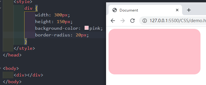
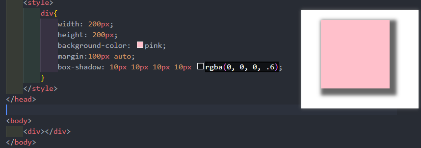
盒子阴影
html
box-shadow 属性为盒子添加阴影
语法:
box-shadow: h-shadow v-shadow blur spread color inset;
注意:
- 默认的但是外阴影(outset),但是不可以写这个单词,否则导致阴影无效
- 盒子阴影不占用控件,不会影响其他盒子排列
举例:box-shadow: 10px 10px 10px 2px rgba(0, 0, 0, .3);
box-shadow 属性为盒子添加阴影
语法:
box-shadow: h-shadow v-shadow blur spread color inset;
注意:
- 默认的但是外阴影(outset),但是不可以写这个单词,否则导致阴影无效
- 盒子阴影不占用控件,不会影响其他盒子排列
举例:box-shadow: 10px 10px 10px 2px rgba(0, 0, 0, .3);| 值 | 描述 |
|---|---|
| h-shadow | 必写。水平阴影的位置。允许负值。 |
| v-shadow | 必写。垂直阴影的位置。允许负值 |
| blur | 可选。模糊距离 |
| spread | 可选。阴影的尺寸 |
| color | 可选。阴影的颜色。 |
| inset | 可选。将外部阴影(outset)改为内部阴影 |
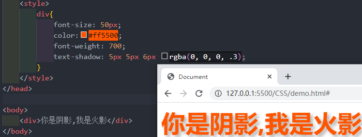
文字阴影
html
text-shadow属性将阴影应用于文本
语法:
text-shadow: h-shadow v-shadow blur color;
text-shadow属性将阴影应用于文本
语法:
text-shadow: h-shadow v-shadow blur color;| 值 | 描述 |
|---|---|
| h-shadow | 必写。水平阴影的位置。允许负值。 |
| v-shadow | 必写。垂直阴影的位置。允许负值 |
| blur | 可选。模糊的距离 |
| color | 可选。阴影的颜色 |
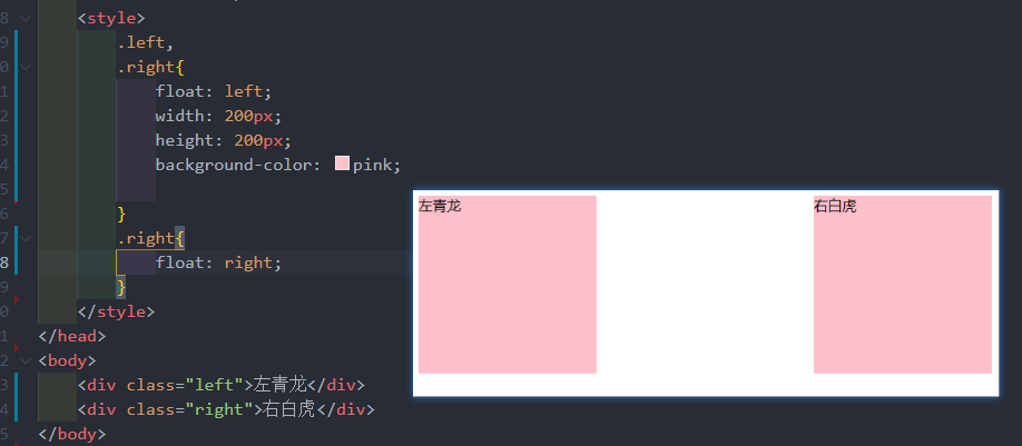
CSS 浮动
html
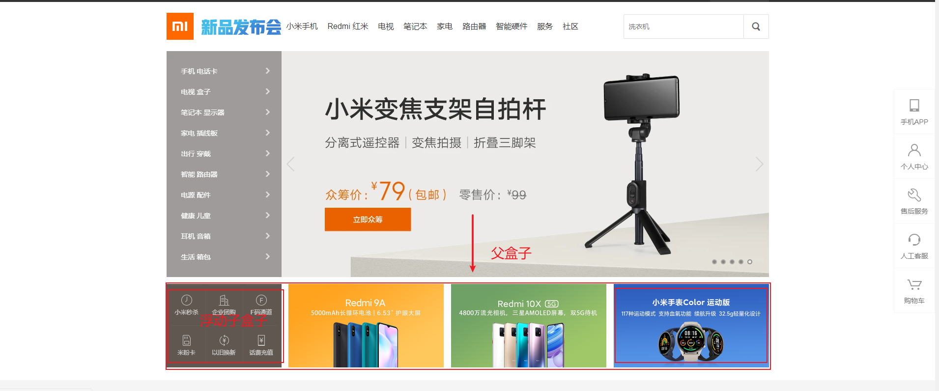
网页布局第一准则:多个块级元素横向排列找浮动纵向排列找标准流,多个块级元素横向排列找浮动。
语法:
选择器 { float:属性值; }
网页布局第一准则:多个块级元素横向排列找浮动纵向排列找标准流,多个块级元素横向排列找浮动。
语法:
选择器 { float:属性值; }| 属性值 | 描述 |
|---|---|
| none | 元素不浮动(默认值) |
| left | 元素向左浮动 |
| right | 元素向右浮动 |
浮动特性(难点1)
html
设置了浮动(float)的元素最重要特性:
- 脱离标准普通流的控制(浮)移动到指定位置(动),(俗称拖标)
- 浮动的盒子不在保留原先的位置
设置了浮动(float)的元素最重要特性:
- 脱离标准普通流的控制(浮)移动到指定位置(动),(俗称拖标)
- 浮动的盒子不在保留原先的位置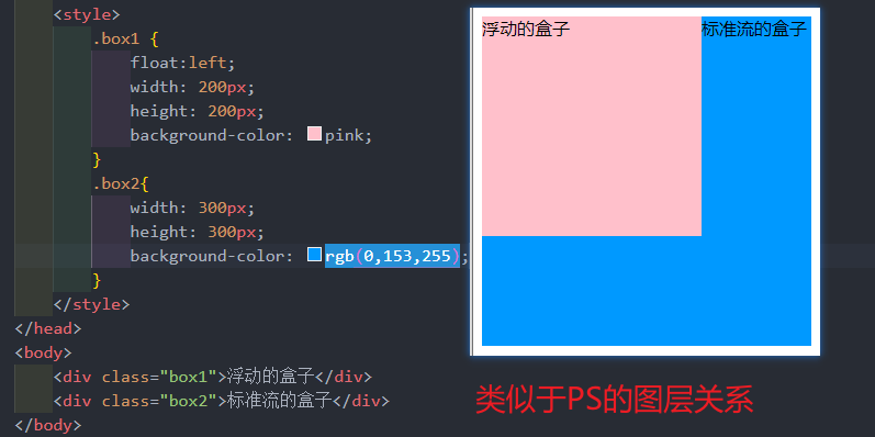
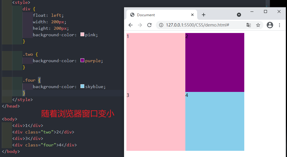
浮动特性(难点2)
html
如果多个盒子都设置了浮动,则他们会按照属性值一行内显示并且顶端对齐排列
注意:
浮动的元素时相互贴靠在一起的(不会有缝隙),如果父级宽度装不下这些浮动的盒子,多出的盒子会另起一行对齐
如果多个盒子都设置了浮动,则他们会按照属性值一行内显示并且顶端对齐排列
注意:
浮动的元素时相互贴靠在一起的(不会有缝隙),如果父级宽度装不下这些浮动的盒子,多出的盒子会另起一行对齐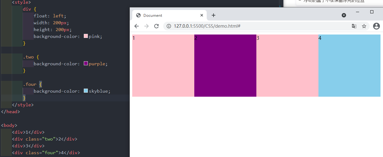
浮点特性(难点3)
html
浮动元素会具有行内块元素特性
任何元素都可以浮动。不管原先时什么模式的元素,添加浮点之后具有行内块元素享受的特性。
- 如果块级盒子没有设置宽度,默认宽度和父级一样宽,但是添加浮动后,他的大小更具内容来决定
- 浮动的盒子中间时没有缝隙的,是紧挨着一起的
- 行内元素同理
浮动元素会具有行内块元素特性
任何元素都可以浮动。不管原先时什么模式的元素,添加浮点之后具有行内块元素享受的特性。
- 如果块级盒子没有设置宽度,默认宽度和父级一样宽,但是添加浮动后,他的大小更具内容来决定
- 浮动的盒子中间时没有缝隙的,是紧挨着一起的
- 行内元素同理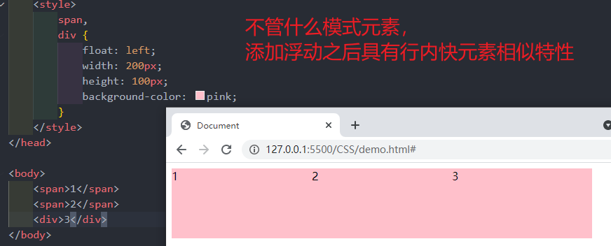
浮点元素经常和标准流父级搭配使用
html
现用标准的父元素排列上下位置,之后内部子元素采取浮动排列左右位置,符合网页布局第一准则现用标准的父元素排列上下位置,之后内部子元素采取浮动排列左右位置,符合网页布局第一准则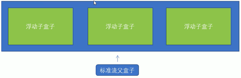
案例1:
html
<!DOCTYPE html>
<html lang="en">

<head>
    <meta charset="UTF-8">
    <meta http-equiv="X-UA-Compatible" content="IE=edge">
    <meta name="viewport" content="width=device-width, initial-scale=1.0">
    <title>Document</title>
    <style>
        * {
            margin: 0;
            padding: 0;
        }

        li {
            list-style: none;
        }

        .box {
            width: 1226px;
            height: 285px;
            background-color: pink;
            margin: 0 auto;
        }

        .box li {
            width: 296px;
            height: 285px;
            background-color: purple;
            float: left;
            margin-right: 14px;
        }

        .box .last {
            margin-right: 0;
        }
    </style>
</head>

<body>
    <ul class="box">
        <li>1</li>
        <li>2</li>
        <li>3</li>
        <li class="last">4</li>
    </ul>
</body>

</html><!DOCTYPE html>
<html lang="en">
<head>
<meta charset="UTF-8">
<meta http-equiv="X-UA-Compatible" content="IE=edge">
<meta name="viewport" content="width=device-width, initial-scale=1.0">
<title>Document</title>
<style>
* {
margin: 0;
padding: 0;
}
li {
list-style: none;
}
.box {
width: 1226px;
height: 285px;
background-color: pink;
margin: 0 auto;
}
.box li {
width: 296px;
height: 285px;
background-color: purple;
float: left;
margin-right: 14px;
}
.box .last {
margin-right: 0;
}
</style>
</head>
<body>
<ul class="box">
<li>1</li>
<li>2</li>
<li>3</li>
<li class="last">4</li>
</ul>
</body>
</html>案例2:
html
<!DOCTYPE html>
<html lang="en">

<head>
    <meta charset="UTF-8">
    <meta http-equiv="X-UA-Compatible" content="IE=edge">
    <meta name="viewport" content="width=device-width, initial-scale=1.0">
    <title>Document</title>
    <style>
        .box {
            width: 1226px;
            height: 615px;
            background-color: pink;
            margin: 0 auto;
        }

        .left {
            float: left;
            height: 615px;
            width: 234px;
            background-color: purple;
        }

        .right {
            float: left;
            width: 992px;
            height: 615px;
            background-color: skyblue;
        }

        .right>div {
            float:left;
            width: 234px;
            height: 300px;
            background-color: pink;
            margin-left: 14px;
            margin-bottom: 14px;
        }
    </style>
</head>

<body>
    <div class="box">
        <div class="left">左青龙</div>
        <div class="right">
            <div>1</div>
            <div>2</div>
            <div>3</div>
            <div>4</div>
            <div>5</div>
            <div>6</div>
            <div>7</div>
            <div>8</div>
        </div>
    </div>
</body>

</html><!DOCTYPE html>
<html lang="en">
<head>
<meta charset="UTF-8">
<meta http-equiv="X-UA-Compatible" content="IE=edge">
<meta name="viewport" content="width=device-width, initial-scale=1.0">
<title>Document</title>
<style>
.box {
width: 1226px;
height: 615px;
background-color: pink;
margin: 0 auto;
}
.left {
float: left;
height: 615px;
width: 234px;
background-color: purple;
}
.right {
float: left;
width: 992px;
height: 615px;
background-color: skyblue;
}
.right>div {
float:left;
width: 234px;
height: 300px;
background-color: pink;
margin-left: 14px;
margin-bottom: 14px;
}
</style>
</head>
<body>
<div class="box">
<div class="left">左青龙</div>
<div class="right">
<div>1</div>
<div>2</div>
<div>3</div>
<div>4</div>
<div>5</div>
<div>6</div>
<div>7</div>
<div>8</div>
</div>
</div>
</body>
</html>常见网页布局
html
<!DOCTYPE html>
<html lang="en">

<head>
    <meta charset="UTF-8">
    <meta http-equiv="X-UA-Compatible" content="IE=edge">
    <meta name="viewport" content="width=device-width, initial-scale=1.0">
    <title>Document</title>
    <style>
        * {
            margin: 0;
            padding: 0;
        }

        div {
            text-align: center;
        }

        li {
            list-style: none;
        }

        .top {
            height: 50px;
            background-color: gray;
        }

        .banner {
            width: 980px;
            height: 150px;
            background-color: gray;
            margin: 10px auto;
        }

        .box {
            width: 980px;
            margin: 0 auto;
            height: 300px;
            background-color: pink;
        }

        .box li {
            float: left;
            width: 237px;
            height: 300px;
            background-color: gray;
            margin-right: 10px;
        }

        .box .last {
            margin-right: 0;
        }

        .footer {
            height: 200px;
            background-color: gray;
            margin-top: 10px;
        }
    </style>
</head>

<body>
    <div class="top">top</div>
    <div class="banner">banner</div>
    <div class="box">
        <ul>
            <li>1</li>
            <li>2</li>
            <li>3</li>
            <li class="last">4</li>
        </ul>
    </div>
    <div class="footer">footer</div>

</body>

</html><!DOCTYPE html>
<html lang="en">
<head>
<meta charset="UTF-8">
<meta http-equiv="X-UA-Compatible" content="IE=edge">
<meta name="viewport" content="width=device-width, initial-scale=1.0">
<title>Document</title>
<style>
* {
margin: 0;
padding: 0;
}
div {
text-align: center;
}
li {
list-style: none;
}
.top {
height: 50px;
background-color: gray;
}
.banner {
width: 980px;
height: 150px;
background-color: gray;
margin: 10px auto;
}
.box {
width: 980px;
margin: 0 auto;
height: 300px;
background-color: pink;
}
.box li {
float: left;
width: 237px;
height: 300px;
background-color: gray;
margin-right: 10px;
}
.box .last {
margin-right: 0;
}
.footer {
height: 200px;
background-color: gray;
margin-top: 10px;
}
</style>
</head>
<body>
<div class="top">top</div>
<div class="banner">banner</div>
<div class="box">
<ul>
<li>1</li>
<li>2</li>
<li>3</li>
<li class="last">4</li>
</ul>
</div>
<div class="footer">footer</div>
</body>
</html>清除浮动
html
由于父级盒子很多情况下,不方便给高度,但是盒子浮动又不占有位置,最后父级盒子高度为0时,就会影响下面的标准流盒子。
- 清除浮动的本质是清除浮动元素造成的影响
- 如果父盒子本身有高度,则不需要清除浮动
- 清除浮动之后,父级就会根据浮动的盒子自动检测高度。父级有了高度,就不会影响下面的标准流了(子级有多高,父级就多高)

语法:
选择器 { clear:属性值 }
由于父级盒子很多情况下,不方便给高度,但是盒子浮动又不占有位置,最后父级盒子高度为0时,就会影响下面的标准流盒子。
- 清除浮动的本质是清除浮动元素造成的影响
- 如果父盒子本身有高度,则不需要清除浮动
- 清除浮动之后,父级就会根据浮动的盒子自动检测高度。父级有了高度,就不会影响下面的标准流了(子级有多高,父级就多高)
语法:
选择器 { clear:属性值 }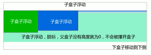
| 属性值 | 描述 |
|---|---|
| left | 不允许左侧有浮动元素(清除左侧浮动的影响) |
| right | 不允许右侧有浮动元素(清除右侧浮动的影响) |
| both | 同时清除左右两侧浮动的影响 |
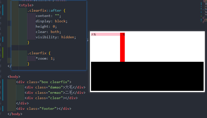
清除浮动——双伪元素清除浮动
html
.clearfix::after {
      content: "";
      display: block;
      height: 0;
      clear: both;
       visibility: hidden;
}

.clearfix {
		/* IE6、7 专有 (可不加) */
       *zoom: 1;
}
.clearfix::after {
content: "";
display: block;
height: 0;
clear: both;
visibility: hidden;
}
.clearfix {
/* IE6、7 专有 (可不加) */
*zoom: 1;
}
清除浮动总结
为什么需要清除浮动?
- 父级没高度
- 子盒子浮动了
- 影响下面布局了,我们就应该清除浮动了
CSS 属性书写顺序
1.布局定位属性:display/ position/ float/ clear/ visibility/ overflow (建议display第一个写,毕竟不关系到模式)
2.自身属性:widht/ height/ margin/ padding/ border/ background
3.文本属性:color/ font/ text-decoration/ text-align/ vertical-align/ white-space/ break-word
4.其他属性(CSS3):content/ cursor/ border-radius/ box-shadow/ text-shadow/ background:linear-gradient...
1.布局定位属性:display/ position/ float/ clear/ visibility/ overflow (建议display第一个写,毕竟不关系到模式)
2.自身属性:widht/ height/ margin/ padding/ border/ background
3.文本属性:color/ font/ text-decoration/ text-align/ vertical-align/ white-space/ break-word
4.其他属性(CSS3):content/ cursor/ border-radius/ box-shadow/ text-shadow/ background:linear-gradient...CSS 定位
定位:将盒子定在某一个位置,所以定位也是在摆放盒子,按照定位的方式移动盒子。 定位 = 定位模式 + 边偏移 定位模式用于指定一个元素在文档中的定位方式。边偏移则决定了该元素的最终位置
子绝父相
孩子绝对定位 父亲相对定位
定位模式
html
定位模式决定元素的定位方式,它通过CSS的 position 属性来设置,其值可以分为四个定位模式决定元素的定位方式,它通过CSS的 position 属性来设置,其值可以分为四个| 值 | 语义 |
|---|---|
| static | 静态定位 |
| relative | 相对定位 |
| absolute | 绝对定位 |
| fixed | 固定定位 |
relative (相对定位)
html
相对定位是元素在移动位置的时候,是相对于它原来的位置来说的
语法:
选择器 { position: releative; }
相对定位的特点:
- 它是相对于自己原来的位置来移动的(移动位置的时候参照点是自己原来的位置)
- 原来在标准流的位置继续占有,后面的盒子仍然以标准流的方式对待它(不脱标,继续保留原来位置)
相对定位是元素在移动位置的时候,是相对于它原来的位置来说的
语法:
选择器 { position: releative; }
相对定位的特点:
- 它是相对于自己原来的位置来移动的(移动位置的时候参照点是自己原来的位置)
- 原来在标准流的位置继续占有,后面的盒子仍然以标准流的方式对待它(不脱标,继续保留原来位置)absolute(绝对定位)
html
绝对定位是元素在移动位置的时候,是相对于它祖先元素来说的
语法:
选择器 { position:absolute; }
绝对定位的特点:
- 如果没有祖先元素或者祖先元素没有定位,则以浏览器为准定位
- 如果祖先元素有定位(相对、绝对、固定定位),则以最近一级的有定位的祖先定位元素为参考移动位置
- 绝对定位不在占用原先的位置
绝对定位是元素在移动位置的时候,是相对于它祖先元素来说的
语法:
选择器 { position:absolute; }
绝对定位的特点:
- 如果没有祖先元素或者祖先元素没有定位,则以浏览器为准定位
- 如果祖先元素有定位(相对、绝对、固定定位),则以最近一级的有定位的祖先定位元素为参考移动位置
- 绝对定位不在占用原先的位置fixed(固定定位)
html
固定定位是元素固定于浏览器可视区的位置。主要使用场景:可以在浏览器页面滚动时元素的位置不会改变
语法:
选择器 { position: fixed; }
固定定位的特点:
- 以浏览器的可视窗口为参照点移动的元素
- 跟父元素没有任何关系
- 不随滚动条滚动
- 固定定位不占有原来的位置
小技巧:  // 固定在版心右侧位置
1.让固定定位的盒子left:50%,走到浏览器可视区一半的位置
2.让固定定位的盒子margin-left:版心宽度的一半距离。 多走版心宽度一半位置
固定定位是元素固定于浏览器可视区的位置。主要使用场景:可以在浏览器页面滚动时元素的位置不会改变
语法:
选择器 { position: fixed; }
固定定位的特点:
- 以浏览器的可视窗口为参照点移动的元素
- 跟父元素没有任何关系
- 不随滚动条滚动
- 固定定位不占有原来的位置
小技巧: // 固定在版心右侧位置
1.让固定定位的盒子left:50%,走到浏览器可视区一半的位置
2.让固定定位的盒子margin-left:版心宽度的一半距离。 多走版心宽度一半位置sticky(粘性定位)
html
粘性定位可以被认为是相对定位和固定定位的混合
语法:
选择器 { position:sticky;top:10px; }
粘性定位的特点:
- 以浏览器的可视窗口为参照点移动元素(固定定位特点)
- 粘性定位占有原来的定位(相对定位特点)
- 必须添加top、left、right、bottom其中一个才有效
粘性定位可以被认为是相对定位和固定定位的混合
语法:
选择器 { position:sticky;top:10px; }
粘性定位的特点:
- 以浏览器的可视窗口为参照点移动元素(固定定位特点)
- 粘性定位占有原来的定位(相对定位特点)
- 必须添加top、left、right、bottom其中一个才有效边偏移
html
边偏移就是定位的盒子移动到最终位置。有top、bottom、left、right 四个属性边偏移就是定位的盒子移动到最终位置。有top、bottom、left、right 四个属性| 值 | 示例 | 描述 |
|---|---|---|
| top | top: 80px | 顶端偏移量,定义元素相对其父元素上边线的距离 |
| bottom | bottom: 80px | 底部偏移量,定义元素相对其父元素下边线的距离 |
| left | left: 80px | 左侧偏移量,定义元素相对于其他父元素左边线的距离 |
| right | right: 80px | 右侧偏移量,定义元素相对于其他父元素右边线的距离 |
定位总结
| 定位模式 | 是否脱标 | 移动位置 | 是否常用 |
|---|---|---|---|
| static | 否 | 不能使用边偏移 | 很少 |
| relative相对定位 | 否(占有位置) | 相对于自身位置移动 | 常用 |
| absolute绝对定位 | 是(不占有位置) | 带有定位的父级 | 常用 |
| fixed固定定位 | 是(不占有位置) | 浏览器可视区 | 常用 |
| sticky粘性定位 | 否(占有位置) | 浏览器可视区 | 一般 |
定位叠放次序(z-index)
html
在使用定位布局时,可能会出现盒子重叠的情况。此时,可以使用z-index来控制盒子的前后次序
语法:
选择器 { z-index:1; }
- 数值可以时正整数、负整数或0,默认时auto,数值越大,盒子越靠上
- 如果属性值相同,则按照书写顺序,后来居上
在使用定位布局时,可能会出现盒子重叠的情况。此时,可以使用z-index来控制盒子的前后次序
语法:
选择器 { z-index:1; }
- 数值可以时正整数、负整数或0,默认时auto,数值越大,盒子越靠上
- 如果属性值相同,则按照书写顺序,后来居上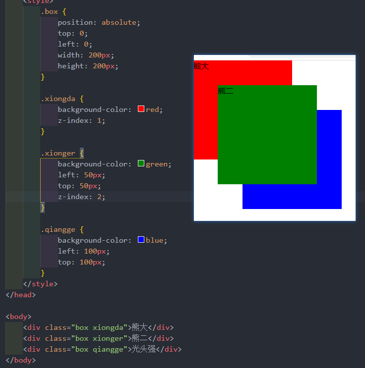
绝对定位的盒子居中
html
加了绝对定位的盒子不能通过margin:0 auto 水平居中,但是可以通过以下计算方法和垂直居中
- left:50%;:让盒子的左侧移动到父级元素的水平中心位置。
- margin-left:-100px:让盒子向左移动自身宽度的一半
加了绝对定位的盒子不能通过margin:0 auto 水平居中,但是可以通过以下计算方法和垂直居中
- left:50%;:让盒子的左侧移动到父级元素的水平中心位置。
- margin-left:-100px:让盒子向左移动自身宽度的一半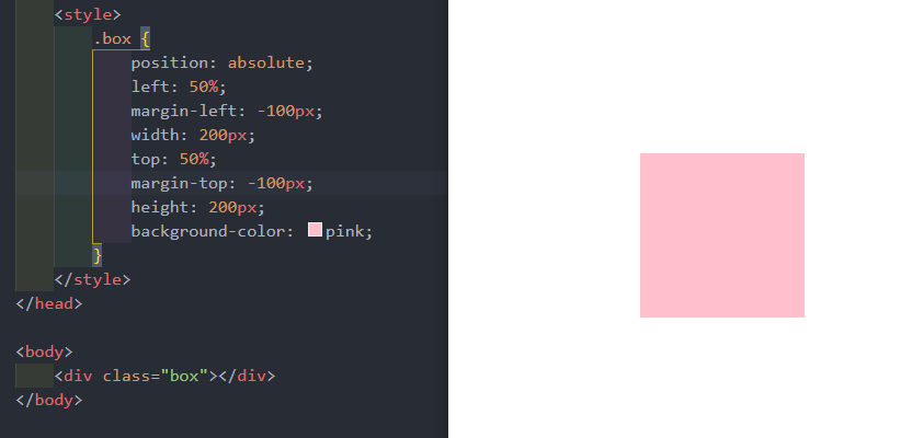
html
绝对定位和固定定位也和浮动类似
- 行内元素添加绝对或者固定定位,可以直接设置高度和宽度。
- 块级元素添加绝对或者固定定位,如果不给宽度或者高度,默认大小是内容的大小
绝对定位和固定定位也和浮动类似
- 行内元素添加绝对或者固定定位,可以直接设置高度和宽度。
- 块级元素添加绝对或者固定定位,如果不给宽度或者高度,默认大小是内容的大小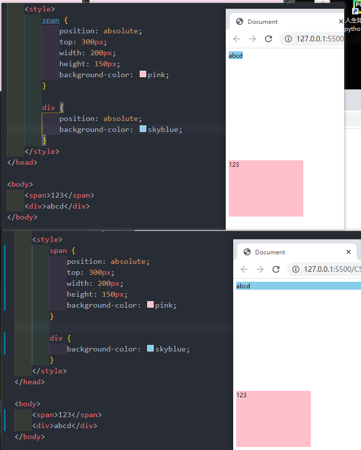
html
绝对定位(固定定位)会完全压住盒子
浮动元素不同,只会压住它下面的标准流的盒子,但是不会压住下面标准流盒子里面的文字
但是绝对定位(固定定位)会压住下面标准流所有的内容
浮动之所以不会压住文字,因为浮动产生的目的最初是为了做文字坏绕效果的。文字会围绕浮动元素
绝对定位(固定定位)会完全压住盒子
浮动元素不同,只会压住它下面的标准流的盒子,但是不会压住下面标准流盒子里面的文字
但是绝对定位(固定定位)会压住下面标准流所有的内容
浮动之所以不会压住文字,因为浮动产生的目的最初是为了做文字坏绕效果的。文字会围绕浮动元素
定位综合案例
html
<!DOCTYPE html>
<html lang="en">
<head>
<meta charset="UTF-8">
<meta http-equiv="X-UA-Compatible" content="IE=edge">
<meta name="viewport" content="width=device-width, initial-scale=1.0">
<title>淘宝轮播图做法</title>
<style>
* {
margin: 0;
padding: 0;
}
li {
list-style: none;
}
.tb-promo {
position: relative;
width: 520px;
height: 280px;
background-color: pink;
margin: 100px auto;
}
.tb-promo.img {
width: 520px;
height: 280px;
}
/* 公共代码抽离 */
.prev,
.next {
position: absolute;
top: 50%;
/* 绝对定位的盒子垂直居中 */
margin-top: -15px;
/* 加了绝对定位的盒子可以直接设置宽度和高度 */
width: 20px;
height: 30px;
background-color: rgba(0, 0, 0, .3);
text-align: center;
line-height: 30px;
color: #fff;
text-decoration: none;
}
.prev {
left: 0;
border-top-right-radius: 15px;
border-bottom-right-radius: 15px;
}
.next {
right: 0;
border-top-left-radius: 15px;
border-bottom-left-radius: 15px;
}
.promo-nav {
position: absolute;
bottom: 15px;
left: 50%;
margin-left: -35px;
width: 70px;
height: 13px;
background: rgba(255, 255, 255, .3);
border-radius: 7px;
}
.promo-nav li {
float: left;
width: 8px;
height: 8px;
background-color: rgb(0, 0, 0);
border-radius: 50%;
margin: 3px;
}
.promo-nav .selected {
background-color: #ff5000;
}
</style>
</head>
<body>
<div class="tb-promo">
<img src="img/淘宝轮播图1.jpg" alt="">
<!-- 左侧按钮 -->
<a href="#" class="prev"> < </a>
<!-- 右侧按钮 -->
<a href="#" class="next"> > </a>
<!-- 小圆点 -->
<ul class="promo-nav">
<li class="selected"></li>
<li></li>
<li></li>
<li></li>
<li></li>
</ul>
</div>
</body>
</html><!DOCTYPE html>
<html lang="en">
<head>
<meta charset="UTF-8">
<meta http-equiv="X-UA-Compatible" content="IE=edge">
<meta name="viewport" content="width=device-width, initial-scale=1.0">
<title>淘宝轮播图做法</title>
<style>
* {
margin: 0;
padding: 0;
}
li {
list-style: none;
}
.tb-promo {
position: relative;
width: 520px;
height: 280px;
background-color: pink;
margin: 100px auto;
}
.tb-promo.img {
width: 520px;
height: 280px;
}
/* 公共代码抽离 */
.prev,
.next {
position: absolute;
top: 50%;
/* 绝对定位的盒子垂直居中 */
margin-top: -15px;
/* 加了绝对定位的盒子可以直接设置宽度和高度 */
width: 20px;
height: 30px;
background-color: rgba(0, 0, 0, .3);
text-align: center;
line-height: 30px;
color: #fff;
text-decoration: none;
}
.prev {
left: 0;
border-top-right-radius: 15px;
border-bottom-right-radius: 15px;
}
.next {
right: 0;
border-top-left-radius: 15px;
border-bottom-left-radius: 15px;
}
.promo-nav {
position: absolute;
bottom: 15px;
left: 50%;
margin-left: -35px;
width: 70px;
height: 13px;
background: rgba(255, 255, 255, .3);
border-radius: 7px;
}
.promo-nav li {
float: left;
width: 8px;
height: 8px;
background-color: rgb(0, 0, 0);
border-radius: 50%;
margin: 3px;
}
.promo-nav .selected {
background-color: #ff5000;
}
</style>
</head>
<body>
<div class="tb-promo">
<img src="img/淘宝轮播图1.jpg" alt="">
<!-- 左侧按钮 -->
<a href="#" class="prev"> < </a>
<!-- 右侧按钮 -->
<a href="#" class="next"> > </a>
<!-- 小圆点 -->
<ul class="promo-nav">
<li class="selected"></li>
<li></li>
<li></li>
<li></li>
<li></li>
</ul>
</div>
</body>
</html>
网页布局总结
1标准流
可以让盒子上下排列或者左右排列,垂直的块级盒子显示就用标准流布局
2浮动
可以让多个块级元素一行显示或者左右对齐盒子,多个块级盒子水平显示就用浮动布局
3定位
定位最大的特点是有层叠概念,就是可以让多个盒子前后叠压来显示。如果元素自由在某个盒子内移动就用定位布局。
元素的显示与隐藏
让一个元素在页面中隐藏或者显示出来
display属性
html
display 属性用于设置一个元素应如何显示
- display: none;; 隐藏对象
- display: block; 除了转换为块级元素之外,同时还有显示元素的意思
display隐藏元素后,不再占有原来的位置
用途及其广泛,搭配JS做特效
display 属性用于设置一个元素应如何显示
- display: none;; 隐藏对象
- display: block; 除了转换为块级元素之外,同时还有显示元素的意思
display隐藏元素后,不再占有原来的位置
用途及其广泛,搭配JS做特效visibility 可见性
html
visibility 属性用于指定一个元素应可见还是隐藏
- visibility:visible;  元素可见
- visibility:hidden; 元素隐藏
visibility隐藏元素后,继续占有原来的位置
visibility 属性用于指定一个元素应可见还是隐藏
- visibility:visible; 元素可见
- visibility:hidden; 元素隐藏
visibility隐藏元素后,继续占有原来的位置overflow 溢出
html
overflow 属性指定了如果内容溢出一个元素的框(超出其指定高度及宽度)时,会发生什么overflow 属性指定了如果内容溢出一个元素的框(超出其指定高度及宽度)时,会发生什么| 属性值 | 描述 |
|---|---|
| visible | 不剪切内容也不添加滚动条 |
| hidden | 不显示超过对象尺寸的内容,超出的部分隐藏掉 |
| scroll | 不管超出内容否,总是显示滚动条 |
| auto | 超出自动显示滚动条,不超出不显示滚动条 |
html
<!DOCTYPE html>
<html lang="en">

<head>
    <meta charset="UTF-8">
    <meta http-equiv="X-UA-Compatible" content="IE=edge">
    <meta name="viewport" content="width=device-width, initial-scale=1.0">
    <title>Document</title>
    <style>
        .tudou {
            position: relative;
            width: 444px;
            height: 320px;
            background-color: pink;
            margin: 30px auto;
        }

        .tudou img {
            width: 100%;
            height: 100%;
        }

        .mask {
            display: none;
            position: absolute;
            top: 0;
            left: 0;
            width: 100%;
            height: 100%;
            background: rgba(0, 0, 0, .4) url(img/播放.png) no-repeat center;
        }

        .tudou:hover .mask {
            display: block;
        }
    </style>
</head>

<body>
    <div class="tudou">
        <div class="mask"></div>
        <img src="img/土豆网.jpg" alt="">
    </div>
</body>

</html><!DOCTYPE html>
<html lang="en">
<head>
<meta charset="UTF-8">
<meta http-equiv="X-UA-Compatible" content="IE=edge">
<meta name="viewport" content="width=device-width, initial-scale=1.0">
<title>Document</title>
<style>
.tudou {
position: relative;
width: 444px;
height: 320px;
background-color: pink;
margin: 30px auto;
}
.tudou img {
width: 100%;
height: 100%;
}
.mask {
display: none;
position: absolute;
top: 0;
left: 0;
width: 100%;
height: 100%;
background: rgba(0, 0, 0, .4) url(img/播放.png) no-repeat center;
}
.tudou:hover .mask {
display: block;
}
</style>
</head>
<body>
<div class="tudou">
<div class="mask"></div>
<img src="img/土豆网.jpg" alt="">
</div>
</body>
</html>CSS 高级技巧
字体图标下载
- icomoon 字库 https://icomoon.io/
- 阿里 iconfont 字库 https://www.iconfont.cn/
- https://www.bilibili.com/video/BV1pE411q7FU?p=256&spm_id_from=pageDriver
字体图标的引用
https://www.bilibili.com/video/BV1pE411q7FU?p=257&spm_id_from=pageDriver
字体图标追加
https://www.bilibili.com/video/BV1pE411q7FU?p=258&spm_id_from=pageDriver
CSS 倒三角
html
网页常见一些三角形,都是使用css直接画出来的网页常见一些三角形,都是使用css直接画出来的案例
html
<style>
    .box1 {
        width: 0;
        height: 0;
        border-top: 50px solid pink;
        border-right: 50px solid red;
        border-bottom: 50px solid blue;
        border-left: 50px solid green;
    }

    .box2 {
        width: 0;
        height: 0;
        border: 50px solid transparent;
        border-top-color: pink;
        margin: 100px auto;
    }

    .jd {
        position: relative;
        width: 120px;
        height: 249px;
        background-color: pink;
    }

    .jd span {
        position: absolute;
        right: 15px;
        top: -10px;
        width: 0;
        height: 0;
        line-height: 0;
        font-size: 0px;
        border: 5px solid transparent;
        border-bottom-color: pink;
    }
</style>

<body>
    <div class="box1"></div>
    <div class="box2"></div>
    <div class="jd">
        <span></span>
    </div>
</body><style>
.box1 {
width: 0;
height: 0;
border-top: 50px solid pink;
border-right: 50px solid red;
border-bottom: 50px solid blue;
border-left: 50px solid green;
}
.box2 {
width: 0;
height: 0;
border: 50px solid transparent;
border-top-color: pink;
margin: 100px auto;
}
.jd {
position: relative;
width: 120px;
height: 249px;
background-color: pink;
}
.jd span {
position: absolute;
right: 15px;
top: -10px;
width: 0;
height: 0;
line-height: 0;
font-size: 0px;
border: 5px solid transparent;
border-bottom-color: pink;
}
</style>
<body>
<div class="box1"></div>
<div class="box2"></div>
<div class="jd">
<span></span>
</div>
</body>CSS 用户界面样式
鼠标样式 cursor
html
语法:
li { cursor: pointer; }

例子:
<ul>
        <li style="cursor: default;">我是默认的小白鼠标样式</li>
        <li style="cursor: pointer;">我是鼠标小手样式</li>
        <li style="cursor: move;">我是鼠标移动样式</li>
        <li style="cursor: text;">我是鼠标文本样式</li>
        <li style="cursor: not-allowed;">我是鼠标禁止样式</li>
</ul>
语法:
li { cursor: pointer; }
例子:
<ul>
<li style="cursor: default;">我是默认的小白鼠标样式</li>
<li style="cursor: pointer;">我是鼠标小手样式</li>
<li style="cursor: move;">我是鼠标移动样式</li>
<li style="cursor: text;">我是鼠标文本样式</li>
<li style="cursor: not-allowed;">我是鼠标禁止样式</li>
</ul>| 属性值 | 描述 |
|---|---|
| default | 小白 |
| pointer | 小手 |
| move | 移动 |
| text | 文本 |
| not-allowed | 禁止 |
轮廓线 outline
html
语法:
input { outline: none; }

例子:     // 建议一开始就取消轮廓线
<style>
        input {
            outline: none;
        }
</style>

<body>
    <input type="text">
</body>
语法:
input { outline: none; }
例子: // 建议一开始就取消轮廓线
<style>
input {
outline: none;
}
</style>
<body>
<input type="text">
</body>防止拖拽文本域 resize
html
语法:
textarea { resize: none;}

例子:
<style>
    textarea {
        resize: none;
    }
</style>

<body>
    <textarea name="" id="" cols="30" rows="10"></textarea>
</body>
语法:
textarea { resize: none;}
例子:
<style>
textarea {
resize: none;
}
</style>
<body>
<textarea name="" id="" cols="30" rows="10"></textarea>
</body>vertical-align 属性应用
CSS 的 vertical-align 属性使用场景:经常用于设置图片或者表单(行内块元素)和文字垂直对齐
html
语法:
vertical-align: baseline | top | middle | bottom

bug:图片低侧会有一个空白缝隙,原因是行内块元素回合文字的基线对齐
主要解决方法有两种
- 给图片添加 vertical-align: middle | top | bottom 等
- 把图片转换为块级元素 display: block;
例子:
<style>
    img {
        /* 让图片和文字垂直居中 */
        vertical-align: middle;
    }
</style>

<body>
    <img src="img/淘宝轮播图1.jpg" alt="">这是一个淘宝轮播图
</body>
语法:
vertical-align: baseline | top | middle | bottom
bug:图片低侧会有一个空白缝隙,原因是行内块元素回合文字的基线对齐
主要解决方法有两种
- 给图片添加 vertical-align: middle | top | bottom 等
- 把图片转换为块级元素 display: block;
例子:
<style>
img {
/* 让图片和文字垂直居中 */
vertical-align: middle;
}
</style>
<body>
<img src="img/淘宝轮播图1.jpg" alt="">这是一个淘宝轮播图
</body>| 值 | 描述 |
|---|---|
| baseline | 默认。元素放置在父元素的基线上 |
| top | 把元素的顶端与行中最高元素的顶端对齐 |
| middle | 把此元素放置在父元素的中部 |
| bottom | 把元素的顶端与行中最低的元素的顶端对齐 |
溢出的文字用省略号显示
单行文本溢出显示省略号--必须满足三个条件
html
/* 1.这个单词的意思是如果文字显示不开自动换行 */
white-space: nowrap;
/* 2.溢出的部分隐藏起来 */
overflow: hidden;
/* 3.文字溢出的时候用省略号来显示 */
text-overflow: ellipsis;
/* 1.这个单词的意思是如果文字显示不开自动换行 */
white-space: nowrap;
/* 2.溢出的部分隐藏起来 */
overflow: hidden;
/* 3.文字溢出的时候用省略号来显示 */
text-overflow: ellipsis;CSS 初始化
html
/* 把我们所有标签的内外边距清零 */
* {
margin: 0;
padding: 0;
/* CSS3盒子模型 */
box-sizing: border-box;
}

/* em 和 i 斜体的文字不倾斜 */
em,
i {
font-style: normal;
}

/* 去掉li标签的小圆点 */
li {
list-style: none;
}

img {
/* border: 0 照顾低版本浏览器 如果图片 外面包含了连接会有边框的问题 */
border: 0;
/* 取下图片低侧有空白缝隙 */
vertical-align: middle;
}

button {
/* 当我们鼠标经过button 按钮的时候,鼠标变成小手 */
cursor: pointer;
}

a {
color: #666;
/* 取消下划线 */
text-decoration: none;
}

a :hover {
/* 经过a标签会变成红色 */
color: #c81623;
}

button,
input {
/* \588B\4F53 宋体 */
font-family: Microsoft YaHei, Heiti SC, tahoma, arial, Hiragino Sans GB, "\588B\4F53", sans-serif;
/* 默认有灰色边框手动去掉 */
border: 0;
/* 去掉蓝色框框 */
outline: none;
}
}

body {
/* 抗锯齿形 让文字显示更加清晰 */
-webkit-font-smoothing: antialiased;
background-color: #fff;
font-family: Microsoft YaHei, Heiti SC, tahoma, arial, Hiragino Sans GB, "\588B\4F53", sans-serif;
color: #666;
}
/* 把我们所有标签的内外边距清零 */
* {
margin: 0;
padding: 0;
/* CSS3盒子模型 */
box-sizing: border-box;
}
/* em 和 i 斜体的文字不倾斜 */
em,
i {
font-style: normal;
}
/* 去掉li标签的小圆点 */
li {
list-style: none;
}
img {
/* border: 0 照顾低版本浏览器 如果图片 外面包含了连接会有边框的问题 */
border: 0;
/* 取下图片低侧有空白缝隙 */
vertical-align: middle;
}
button {
/* 当我们鼠标经过button 按钮的时候,鼠标变成小手 */
cursor: pointer;
}
a {
color: #666;
/* 取消下划线 */
text-decoration: none;
}
a :hover {
/* 经过a标签会变成红色 */
color: #c81623;
}
button,
input {
/* \588B\4F53 宋体 */
font-family: Microsoft YaHei, Heiti SC, tahoma, arial, Hiragino Sans GB, "\588B\4F53", sans-serif;
/* 默认有灰色边框手动去掉 */
border: 0;
/* 去掉蓝色框框 */
outline: none;
}
}
body {
/* 抗锯齿形 让文字显示更加清晰 */
-webkit-font-smoothing: antialiased;
background-color: #fff;
font-family: Microsoft YaHei, Heiti SC, tahoma, arial, Hiragino Sans GB, "\588B\4F53", sans-serif;
color: #666;
}HTML5 的新特性
HTML5 新增的多媒体标签
视频<video>
html
语法:
<video src="文件地址" controls="controls"></video>
语法:
<video src="文件地址" controls="controls"></video>| 属性 | 值 | 描述 |
|---|---|---|
| autoplay | autoplay | 视频就绪自动播放 |
| controls | controls | 向用户显示播放控件 |
| width | 像素 | 设置播放器宽度 |
| height | 像素 | 设置播放器高度 |
| loop | loop | 播放完是否继续播放该视频,循环播放 |
| preload | auto 预加载;none 不预加载 | 规定是否预加载视频 |
| src | url | 视频url地址 |
| poster | Imgurl | 加载等待的画面图片 |
| muted | muted | 静音播放 |
音频<audio>
html
语法:
<audio src="文件地址" controls="controls"></audio>
语法:
<audio src="文件地址" controls="controls"></audio>| 属性 | 值 | 描述 |
|---|---|---|
| autoplay | autoplay | 如果出现该属性,则音频就绪后马上播放 |
| controls | controls | 如果出现该属性,则向用户显示控件,比如播放按钮 |
| loop | loop | 播放完是否继续播放该视频,循环播放 |
| src | url | 要播放的音频的url |
input类型
html
语法:
<!-- 我们验证的时候必须添加form表单域 -->
<form action="">
    <ul>
        <li>邮箱: <input type="email" /></li>
        <!-- 当我们点击提交按钮就可以验证表单了 -->
        <li> <input type="submit" value="提交"></li>
    </ul>
</form>
语法:
<!-- 我们验证的时候必须添加form表单域 -->
<form action="">
<ul>
<li>邮箱: <input type="email" /></li>
<!-- 当我们点击提交按钮就可以验证表单了 -->
<li> <input type="submit" value="提交"></li>
</ul>
</form>| 属性 | 说明 |
|---|---|
| type="email" | 限制用户输入必须为Email类型 |
| type="url" | 限制用户输入必须为url类型 |
| type="date" | 限制用户输入必须为日期类型 |
| type="time" | 限制用户输入必须为时间类型 |
| type="month" | 限制用户输入必须为月类型 |
| type="week" | 限制用户输入必须为周类型 |
| type="number" | 限制用户输入必须为数字类型 |
| type="tel" | 手机号码 |
| type="search" | 搜索框 |
| type="color" | 生成一个颜色选择表单 |
表单
html
语法:
 <input type="search" name="" id="" required="required" placeholder="测试">
语法:
<input type="search" name="" id="" required="required" placeholder="测试">| 属性 | 值 | 说明 |
|---|---|---|
| required | required | 表单拥有该属性表示其内容不能为空,必填 |
| placeholder | 提示文本 | 表单的提示信息,页面加载完成自动聚焦到指定表单 |
| autofocus | autofocus | 自动聚焦属性,页面加载完成自动聚焦到指定表单 |
| autocomplete | off/on | 浏览器记录以前的记录默认是打开 |
| multiple | multiple | 可以多选文件提交 |
CSS3 的新特性
CSS3 新增选择器
属性选择器
html
<style>
    /* 只选取 type=text 文本框的input 选取出来 */
    input[type=text] {
        color: pink
    }
</style>

<body>
    <!-- 属性选择器还可以选择属性=值的某些元素 -->
    <input type="text" name="" id="">
    <input type="password" name="" id="">
</body><style>
/* 只选取 type=text 文本框的input 选取出来 */
input[type=text] {
color: pink
}
</style>
<body>
<!-- 属性选择器还可以选择属性=值的某些元素 -->
<input type="text" name="" id="">
<input type="password" name="" id="">
</body>结构伪类选择器
html
<style>
    /* 1.选择ul里面的第一个孩子 小Li */

    ul li:first-child {
        background-color: pink;
    }
    /* 2.选择ul里面的最后一个孩子 小Li */

    ul li:last-child {
        background-color: pink;
    }
    /* 3.选择ul里面的第二个孩子 小Li */

    ul li:nth-child(4) {
        background-color: blue;
    }
</style>

<body>
    <ul>
        <li>我是第1个孩子</li>
        <li>我是第2个孩子</li>
        <li>我是第3个孩子</li>
        <li>我是第4个孩子</li>
        <li>我是第5个孩子</li>
        <li>我是第6个孩子</li>
        <li>我是第7个孩子</li>
        <li>我是第8个孩子</li>
        <li>我是第9个孩子</li>
    </ul>
</body><style>
/* 1.选择ul里面的第一个孩子 小Li */
ul li:first-child {
background-color: pink;
}
/* 2.选择ul里面的最后一个孩子 小Li */
ul li:last-child {
background-color: pink;
}
/* 3.选择ul里面的第二个孩子 小Li */
ul li:nth-child(4) {
background-color: blue;
}
</style>
<body>
<ul>
<li>我是第1个孩子</li>
<li>我是第2个孩子</li>
<li>我是第3个孩子</li>
<li>我是第4个孩子</li>
<li>我是第5个孩子</li>
<li>我是第6个孩子</li>
<li>我是第7个孩子</li>
<li>我是第8个孩子</li>
<li>我是第9个孩子</li>
</ul>
</body>结构伪类选择器奇偶选择
html
<style>
    /* 1.把所有偶数 even的孩子选出来 */
    ul li:nth-child(even) {
        background-color: blue;
    }
    /* 2.把所有奇数 odd的孩子选出来 */
    ul li:nth-child(odd) {
        background-color: blue;
    }
</style>

<body>
    <ul>
        <li>我是第1个孩子</li>
        <li>我是第2个孩子</li>
        <li>我是第3个孩子</li>
        <li>我是第4个孩子</li>
        <li>我是第5个孩子</li>
        <li>我是第6个孩子</li>
        <li>我是第7个孩子</li>
        <li>我是第8个孩子</li>
        <li>我是第9个孩子</li>
    </ul>
</body><style>
/* 1.把所有偶数 even的孩子选出来 */
ul li:nth-child(even) {
background-color: blue;
}
/* 2.把所有奇数 odd的孩子选出来 */
ul li:nth-child(odd) {
background-color: blue;
}
</style>
<body>
<ul>
<li>我是第1个孩子</li>
<li>我是第2个孩子</li>
<li>我是第3个孩子</li>
<li>我是第4个孩子</li>
<li>我是第5个孩子</li>
<li>我是第6个孩子</li>
<li>我是第7个孩子</li>
<li>我是第8个孩子</li>
<li>我是第9个孩子</li>
</ul>
</body>伪元素选择器
html
<style>
    div {
    width: 200px;
    height: 200px;
    background-color: pink;
    }

    div::before {
    /* 这个content是必须要写的 */
    content: '我';
    }

    div::after {
     /* 这个content是必须要写的 */
    content: '冉勇';
    }
</style><style>
div {
width: 200px;
height: 200px;
background-color: pink;
}
div::before {
/* 这个content是必须要写的 */
content: '我';
}
div::after {
/* 这个content是必须要写的 */
content: '冉勇';
}
</style>| 选择符 | 简介 |
|---|---|
| ::before | 在元素内部的前面插入内容 |
| ::after | 在元素内部的后面插入内容 |
伪元素选择器使用场景1:伪元素字体图标
html
div::after {
    position: absolute;
    top: 10px;
    right: 10px;
    font-family: 'icomoon';
    content: '\e904';
    color: red;
    font-size: 18px;
}
div::after {
position: absolute;
top: 10px;
right: 10px;
font-family: 'icomoon';
content: '\e904';
color: red;
font-size: 18px;
}伪元素选择器使用场景2:伪元素清楚浮动
html
方法一:
.clearfix:after {
	content: "";	// 伪元素必须写的属性
	display: block;	// 插入的元素必须是块级
	height: 0;	// 不要看见这个元素
	clear: both;	// 核心代码清楚浮动
	visibility: hidden;	// 不要看见这个元素
}
方法二:
.clearfix:before,.clearfix:after {
	content: "";
	display: table;	// 转换为块级元素并且一行显示
}
.clearfix:after {
	clear:both;
}
方法一:
.clearfix:after {
content: ""; // 伪元素必须写的属性
display: block; // 插入的元素必须是块级
height: 0; // 不要看见这个元素
clear: both; // 核心代码清楚浮动
visibility: hidden; // 不要看见这个元素
}
方法二:
.clearfix:before,.clearfix:after {
content: "";
display: table; // 转换为块级元素并且一行显示
}
.clearfix:after {
clear:both;
}CSS3 盒子模型
html
CSS3 中可以通过box-sizing来指定盒模型,有2个值:即可指定为content-box、border-box,这样我们计算盒子大小的方式就发生了改变

可以分成两种情况:
1、box-sizing:content-box 盒子大小为 width+ paadding+ border
2、box-sizing:border-box 盒子大小为width
CSS3 中可以通过box-sizing来指定盒模型,有2个值:即可指定为content-box、border-box,这样我们计算盒子大小的方式就发生了改变
可以分成两种情况:
1、box-sizing:content-box 盒子大小为 width+ paadding+ border
2、box-sizing:border-box 盒子大小为widthCSS3 其他特性
1、图片变模糊
2、计算盒子宽度width:calc函数
CSS3 滤镜filter:
html
filter CSS属性将模糊或颜色偏移等图形效果应用于元素
语法:
filter: 函数();
举例:
filter:blur(5px);  blur模糊处理 数值越大越模糊
filter CSS属性将模糊或颜色偏移等图形效果应用于元素
语法:
filter: 函数();
举例:
filter:blur(5px); blur模糊处理 数值越大越模糊CSS3 calc 函数:
html
calc() 此CSS函数让你在声明CSS属性值时执行一些计算
width:calc(100% - 80px);     // 随宽度减去80像素
括号里面可以 + - * / 来进行计算
calc() 此CSS函数让你在声明CSS属性值时执行一些计算
width:calc(100% - 80px); // 随宽度减去80像素
括号里面可以 + - * / 来进行计算CSS3 过渡
html
traaansition: 要过渡的属性 花费时间 运动曲线 何时开始;
1、属性: 想要变化的 CSS 属性,宽度高度 背景颜色 内外边距都可以。如果想要所有的属性都变化,写一个all就可以。
2、花费时间: 单位是 秒(必须写单位) 比如 0.5s
3、运动曲线:默认是ease(可以省略)
4、何时开始:单位是 秒(必须填写单位)可以设置延迟触发时间 默认 0s (可以省略)
谁做过渡,给谁加
例子:
<!DOCTYPE html>
<html lang="en">

<head>
    <meta charset="UTF-8">
    <meta http-equiv="X-UA-Compatible" content="IE=edge">
    <meta name="viewport" content="width=device-width, initial-scale=1.0">
    <title>Document</title>
    <style>
        div {
            width: 200px;
            height: 100px;
            background-color: pink;
            /* transition: 变化的属性 花费时间 运动曲线 何时开始; */
            /* transition: width .5s; */
            /* 如果想要写多个属性,利用逗号进行分割 */
            /* transition: width .5s, height .5s; */
            /* 如果想要多个属性都变化,属性写all就可以了 */
            /* 谁做过渡,给谁加 */
            transition: all .5s;
        }

        div:hover {
            width: 300px;
            height: 200px;
            background-color: skyblue;
        }
    </style>
</head>

<body>
    <div></div>
</body>

</html>
traaansition: 要过渡的属性 花费时间 运动曲线 何时开始;
1、属性: 想要变化的 CSS 属性,宽度高度 背景颜色 内外边距都可以。如果想要所有的属性都变化,写一个all就可以。
2、花费时间: 单位是 秒(必须写单位) 比如 0.5s
3、运动曲线:默认是ease(可以省略)
4、何时开始:单位是 秒(必须填写单位)可以设置延迟触发时间 默认 0s (可以省略)
谁做过渡,给谁加
例子:
<!DOCTYPE html>
<html lang="en">
<head>
<meta charset="UTF-8">
<meta http-equiv="X-UA-Compatible" content="IE=edge">
<meta name="viewport" content="width=device-width, initial-scale=1.0">
<title>Document</title>
<style>
div {
width: 200px;
height: 100px;
background-color: pink;
/* transition: 变化的属性 花费时间 运动曲线 何时开始; */
/* transition: width .5s; */
/* 如果想要写多个属性,利用逗号进行分割 */
/* transition: width .5s, height .5s; */
/* 如果想要多个属性都变化,属性写all就可以了 */
/* 谁做过渡,给谁加 */
transition: all .5s;
}
div:hover {
width: 300px;
height: 200px;
background-color: skyblue;
}
</style>
</head>
<body>
<div></div>
</body>
</html>过渡案例2
html
<!DOCTYPE html>
<html lang="en">

<head>
    <meta charset="UTF-8">
    <meta http-equiv="X-UA-Compatible" content="IE=edge">
    <meta name="viewport" content="width=device-width, initial-scale=1.0">
    <title>Document</title>
    <style>
        .bar {
            width: 150px;
            height: 15px;
            border: 1px solid red;
            border-radius: 7px;
            padding: 1px
        }

        .bar_in {
            width: 50%;
            height: 100%;
            background-color: red;
            transition: all .5s;
        }

        .bar:hover .bar_in {
            width: 100%;
        }
    </style>
</head>

<body>
    <div class="bar">
        <div class="bar_in"></div>
    </div>
</body>

</html><!DOCTYPE html>
<html lang="en">
<head>
<meta charset="UTF-8">
<meta http-equiv="X-UA-Compatible" content="IE=edge">
<meta name="viewport" content="width=device-width, initial-scale=1.0">
<title>Document</title>
<style>
.bar {
width: 150px;
height: 15px;
border: 1px solid red;
border-radius: 7px;
padding: 1px
}
.bar_in {
width: 50%;
height: 100%;
background-color: red;
transition: all .5s;
}
.bar:hover .bar_in {
width: 100%;
}
</style>
</head>
<body>
<div class="bar">
<div class="bar_in"></div>
</div>
</body>
</html>